Location is everything.
I was just reading an article about a new yogurt shop that opened up in a historic looking neighborhood. The residents and business owners had quite a negative response to it, as the sign was neon orange and green, with an anime look to it. One even went as far as saying that it was a “horribleriffic monstrosity.”
Now you might be asking yourself, “What’s wrong with neon orange a green? I happen to like those colors.” You’re right, those colors are great. But the key comment I found in the article to be the most revealing about the harsh response to the sign is this: “I too agree that the sign is not the right one for the neighborhood.” The owner himself said that, realizing the mistake.
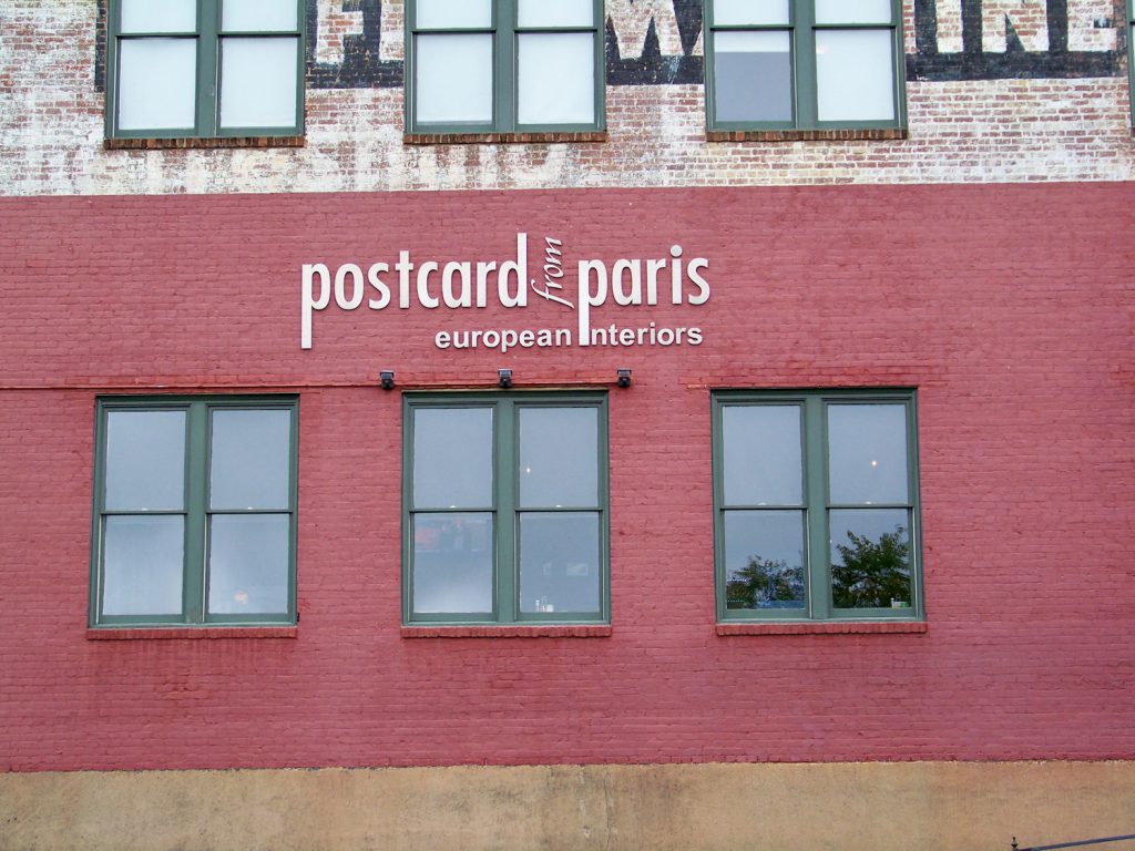
The location of your business should be a key factor in deciding what your sign is going to look like without compromising your brand image. This is especially important if you are a potential or already existing small business owner. Unlike Starbucks, you cannot just do whatever you want. This yogurt business is a perfect example of not taking the location into consideration. The area they decided to set up shop happened to be a quaint, historical looking neighborhood with brick buildings and vintage-y looking structures. Their sign probably would have gotten a better response had they used an older looking font and muted colors. The neon’s would have gone over very well in a more artsy district, or perhaps a larger downtown area in a big city. Here are some store fronts that I feel represents their brand AND location well:
This store front signage located in the Downtown of Greenville, South Carolina is simple, elegant and communicates exactly what they are about. They did a good job of mixing historic and modern themes to go along with the recently painted but old brick building.
This store front located near UCLA in Los Angeles, California took a more bold approach but did not skirt the fine line between eye-catching and obnoxious. The building has a more modern look, so the bright neon green and the contemporary font goes great in this location.
Your store front signage is important; it’s the first impression and the face of your product. Where a person decides to eat, shop and spend their time heavily relies on your look. Make it a sight that is worth their while.


